Introduction to Cryptocurrency Price Charts
Cryptocurrency has grown into one of the most exciting financial markets in the world, attracting millions of investors and traders every day. Unlike traditional markets such as stocks or commodities, crypto is open 24/7, which means price movements can happen at any time—day or night. To make smart decisions, beginners need to understand one important tool: the cryptocurrency price chart“.How to Read Cryptocurrency Price Charts”
A crypto price chart is like a storybook of the market. It tells you where the price has been, where it might be going, and what traders are thinking right now. Think of it as a weather forecast for the crypto world—it doesn’t guarantee what will happen next, but it gives you strong clues. Without charts, trading crypto would be like driving blindfolded.
Many beginners believe reading charts is complicated or only for professional traders. That’s a myth. With the right guidance, anyone can learn how to read crypto charts step by step. The best part? Once you understand them, you’ll never look at crypto the same way again. Instead of guessing, you’ll make informed decisions—whether you’re buying Bitcoin, Ethereum, or any other altcoin.
In this guide, we’ll break down everything about crypto price charts in simple English. No jargon, no unnecessary complexity—just a practical roadmap to help beginners build confidence.”How to Read Cryptocurrency Price Charts”
Also read: Top 5 Cryptocurrencies to Watch in 2025
Table of Contents
Why Price Charts Matter in Crypto Trading
Price charts aren’t just lines and numbers; they are the heartbeat of the crypto market. Every candle, every movement, and every trend reflects the emotions of thousands (sometimes millions) of traders worldwide. Here’s why they matter:
- They show market history – A chart records every price movement in the past, giving you insights into how a coin has behaved during bull runs, crashes, or sideways phases.
- They help predict future moves – While no chart is 100% accurate, patterns often repeat. Traders use historical price action to forecast potential outcomes.
- They highlight buying and selling pressure – Ever wondered why Bitcoin suddenly crashes or pumps? Charts reveal whether buyers (bulls) or sellers (bears) are in control.
- They help manage risk – By identifying entry and exit points, you can protect yourself from massive losses.
Imagine trying to sail a boat in the ocean without a map. You’d be lost, right? Similarly, trading without reading charts is like guessing where the wind will blow. Charts give you a map of the crypto market.”How to Read Cryptocurrency Price Charts”
Also read: What Is Blockchain Technology? Explained Simply
Common Myths About Reading Crypto Charts
Before we go deeper, let’s clear a few myths that stop beginners from learning chart reading:
- Myth 1: Only experts can read charts.
Truth: Anyone can learn with practice. Even if you’re a beginner, you can start with basic concepts and grow from there. - Myth 2: Charts always predict the future.
Truth: Charts give signals, not guarantees. They show probabilities, not certainties. - Myth 3: You need expensive software.
Truth: Many free platforms like TradingView or CoinMarketCap already provide great charting tools. - Myth 4: It’s too complicated.
Truth: At first, charts may look overwhelming. But once you understand the basics—time, price, candles—it becomes as easy as reading a simple graph.”How to Read Cryptocurrency Price Charts”
Breaking these myths is important because it allows beginners to approach chart reading with confidence instead of fear.
Basics of Cryptocurrency Price Charts
A cryptocurrency price chart is simply a visual representation of how the price of a coin has moved over time. Think of it as a timeline of emotions—buyers pushing the price up and sellers pushing it down.
The two most important parts of any chart are:
- Price Axis (Vertical/Y-axis): This shows the value of the cryptocurrency in your chosen currency (like INR, USD, or BTC).
- Time Axis (Horizontal/X-axis): This shows the timeline—minutes, hours, days, weeks, or months.
Together, these two axes form the foundation of price charts. Every trader relies on them to track whether the market is moving up, down, or sideways.
Types of Price Charts
There are several types of charts used in crypto trading, but the most popular ones are:
- Line Chart: Simplest type. Shows a line connecting closing prices over time. Good for beginners but lacks details.
- Bar Chart: More advanced. Displays open, high, low, and close (OHLC) prices.
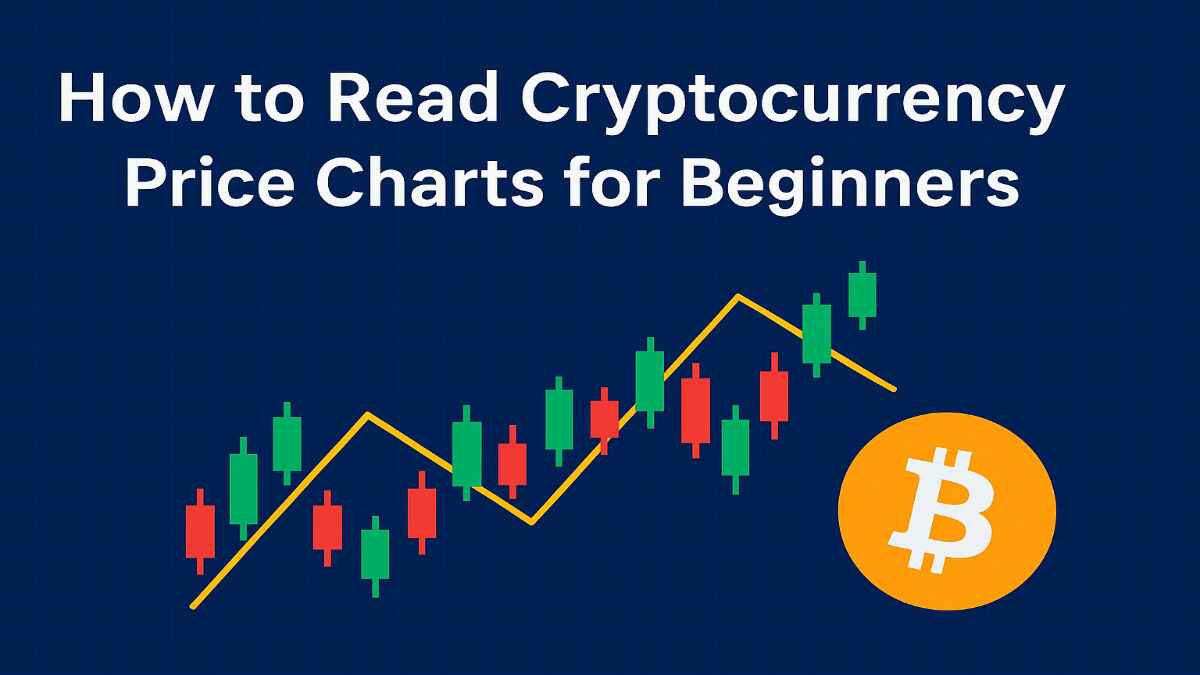
- Candlestick Chart: The most popular type. Shows the same information as bar charts but in a more visual and colorful format.
Pros and Cons of Each Chart Type (Table)
| Chart Type | Pros | Cons | Best For |
|---|---|---|---|
| Line Chart | Simple, easy to read, beginner-friendly | Lacks detail (no highs/lows) | New traders |
| Bar Chart | Shows OHLC clearly, more data | Harder to read than candlesticks | Intermediate traders |
| Candlestick Chart | Very visual, shows market psychology | Can be overwhelming for beginners | All traders |
Candlestick charts are by far the most popular because they tell a story. The color and shape of a candle show whether buyers or sellers were stronger in that timeframe. That’s why in this guide, we’ll focus more on candlestick charts.
Key Components of a Crypto Price Chart
When you first open a price chart, it might look like a mess of candles, lines, and numbers. But once you break it down, you’ll see it’s actually quite logical. Here are the main components every beginner must know:”How to Read Cryptocurrency Price Charts”
- Price Axis (Y-Axis): Located vertically on the right side, it shows the price level. If Bitcoin is trading at ₹2,500,000, that’s where you’ll see it.
- Time Axis (X-Axis): Located at the bottom, it shows the selected time frame (minutes, hours, days, etc.).
- Trading Volume: Usually shown as vertical bars at the bottom of the chart. Higher bars mean more activity. Low volume can indicate weak trends.
- Market Cap and Circulating Supply: Often displayed separately on platforms like CoinMarketCap. Market cap shows the total value of a coin (Price × Supply).
Each of these elements plays a role in helping traders make informed decisions. For example, if you see Bitcoin rising in price with high volume, it usually means the move is strong and supported by many traders. But if the price rises on low volume, it may not last.
Also read: What Is a Crypto Wallet and Which One to Use?
Understanding Candlestick Charts
Candlestick charts are the heart of crypto trading. They originated in Japan centuries ago and are still the most powerful way to visualize price action today.”How to Read Cryptocurrency Price Charts”
Anatomy of a Candlestick
A candlestick has three main parts:
- Body: The thick middle part that shows the opening and closing price.
- Wicks (Shadows): Thin lines above and below the body showing the highest and lowest prices.
- Color: Green (or white) means bullish (price went up), red (or black) means bearish (price went down).
Bullish vs. Bearish Candlesticks
- A bullish candle (green) shows that buyers were stronger. The close price is higher than the open.
- A bearish candle (red) shows sellers were stronger. The close price is lower than the open.
Common Candlestick Patterns
Some candlestick formations give hints about where the market might go:
- Doji: When the open and close are almost the same—shows indecision.
- Hammer: Small body with a long lower wick—can signal a reversal.
- Engulfing: A larger candle that covers the previous one—often a strong trend signal.
Identifying Trends in Crypto Charts
One of the most important skills in crypto trading is spotting trends. A trend is simply the general direction in which the market is moving. If you can identify whether a coin is in an uptrend, downtrend, or sideways phase, you’ll be ahead of most beginners who trade blindly.
- Uptrend (Bullish Market): This is when prices keep moving higher over time. On a chart, you’ll see higher highs (each peak is higher than the last) and higher lows (each dip is higher than the last). Example: Bitcoin during a bull run.
- Downtrend (Bearish Market): Prices keep falling. You’ll notice lower highs and lower lows. Example: the 2018 crypto winter.
- Sideways Market (Consolidation): Prices don’t move much up or down. Instead, they stay within a range. Many traders get frustrated here, but sideways markets often set the stage for big moves later.
How to Draw Trend Lines
Trend lines are like the backbone of chart reading. They connect points on the chart to show direction:
- For an uptrend, draw a line connecting the lows.
- For a downtrend, draw a line connecting the highs.
If prices respect these lines multiple times, it means traders are paying attention to them.
Support and Resistance Levels
- Support: A price level where buying pressure is strong enough to stop the price from falling further. Think of it like the “floor” of the market.
- Resistance: A price level where selling pressure is strong enough to stop the price from rising. Think of it as the “ceiling.”
When support is broken, it often becomes new resistance—and vice versa. Traders love these levels because they act as decision points for buying or selling.
Also read: How to Store Cryptocurrency Safely
Introduction to Technical Indicators
If candlestick charts are the foundation, then technical indicators are like extra tools in your toolkit. Indicators use mathematical formulas to analyze past price movements and give traders signals about potential future direction.
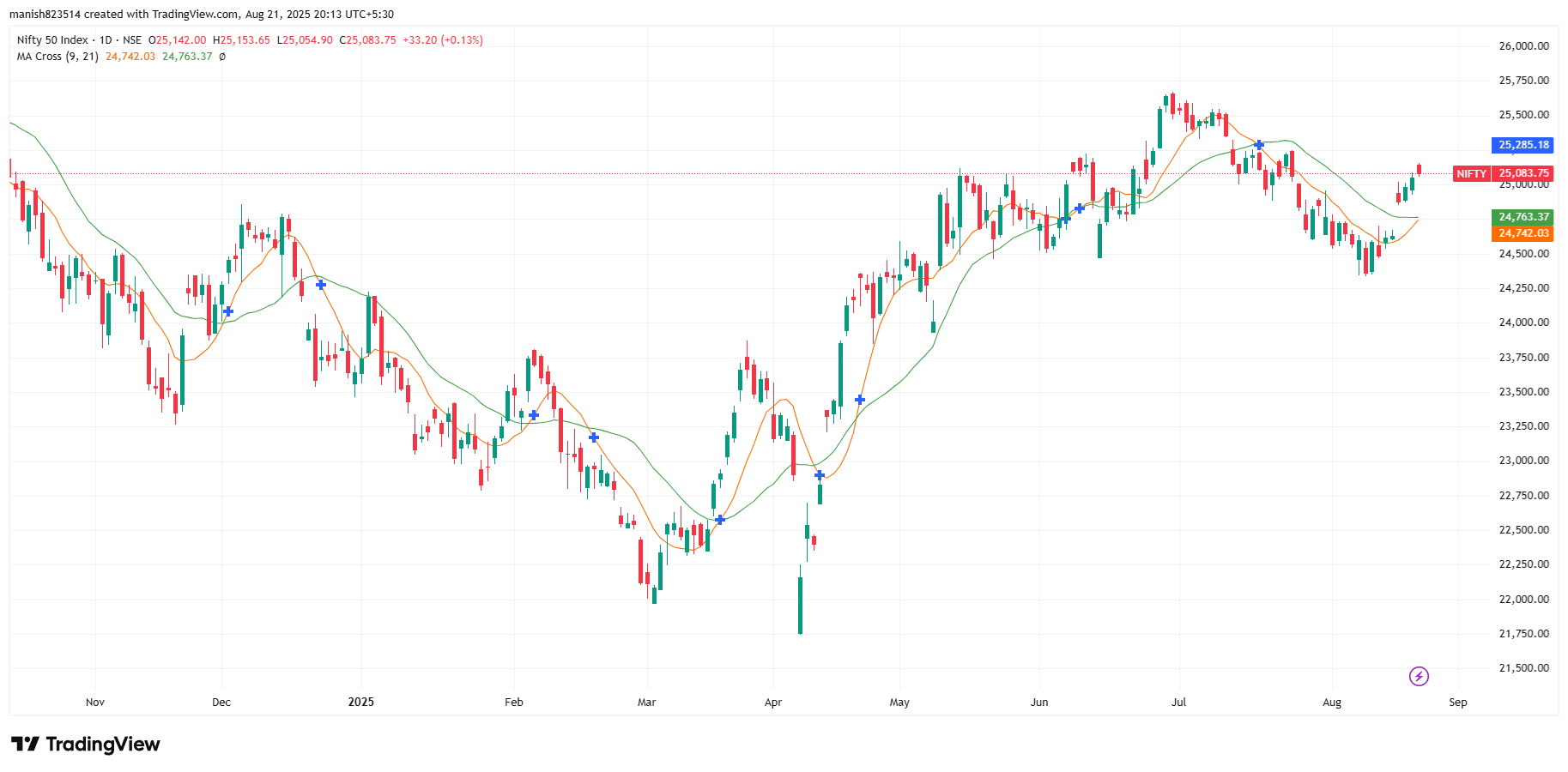
Moving Averages (MA)
Moving averages smooth out price data so you can see the trend clearly.
- Simple Moving Average (SMA): The average price over a specific period (e.g., 50-day SMA).
- Exponential Moving Average (EMA): Gives more weight to recent prices, making it more responsive to current trends.
Example: If Bitcoin is trading above the 200-day SMA, many traders see it as a bullish sign.
Relative Strength Index (RSI)
RSI measures overbought or oversold conditions on a scale of 0–100.
- Above 70 = Overbought (price may fall).
- Below 30 = Oversold (price may rise).
MACD (Moving Average Convergence Divergence)
MACD shows momentum and trend changes by comparing two moving averages.
- When the MACD line crosses above the signal line → bullish signal.
- When it crosses below → bearish signal.
Bollinger Bands
These are bands plotted above and below a moving average. They expand and contract based on market volatility.
- When bands are tight, expect a big move soon.
- When price touches the upper band, it may be overbought.
Reading Trading Volume with Price Action
Volume is like the voice of the market. It tells you how many people are trading a coin at a particular time. Without volume, price movements are weak and unreliable.
Volume Spikes
When you see unusually high volume, it means something big is happening:
- A price surge with high volume = strong bullish momentum.
- A price drop with high volume = strong bearish momentum.
- A price move with low volume = weak and untrustworthy.
High vs. Low Volume
- High volume: Confirms trends. If Ethereum breaks resistance with high volume, it’s likely to keep rising.
- Low volume: Often leads to false signals. A breakout without volume usually fails.
Combining Volume with Trends
- If price is rising and volume is rising, the uptrend is strong.
- If price is rising but volume is falling, it’s a warning sign. The trend may reverse soon.
Traders often use indicators like On-Balance Volume (OBV) to measure whether volume supports price action.
Remember: Price shows direction, but volume shows strength. If you learn to read both together, you’ll avoid many beginner mistakes.
Timeframes in Crypto Chart Analysis
One thing that confuses beginners is the concept of timeframes. A timeframe is simply the period that each candlestick represents. For example, in a 1-hour chart, each candle shows one hour of price action.
Short-Term Charts (1m, 5m, 15m)
- Best for day traders or scalpers who want quick profits.
- Show small price movements but can be noisy.
- Good for spotting very short-term trends.
Medium-Term Charts (1H, 4H, Daily)
- Most popular among swing traders.
- Balance between too much noise and long-term clarity.
- A 4-hour chart, for example, is excellent for identifying patterns.
Long-Term Charts (Weekly, Monthly)
- Used by long-term investors (“HODLers”).
- Show the big picture of the market.
- Help avoid panic during short-term volatility.
Also read: Best Crypto Exchanges for Indian Users
Chart Patterns Every Beginner Should Know
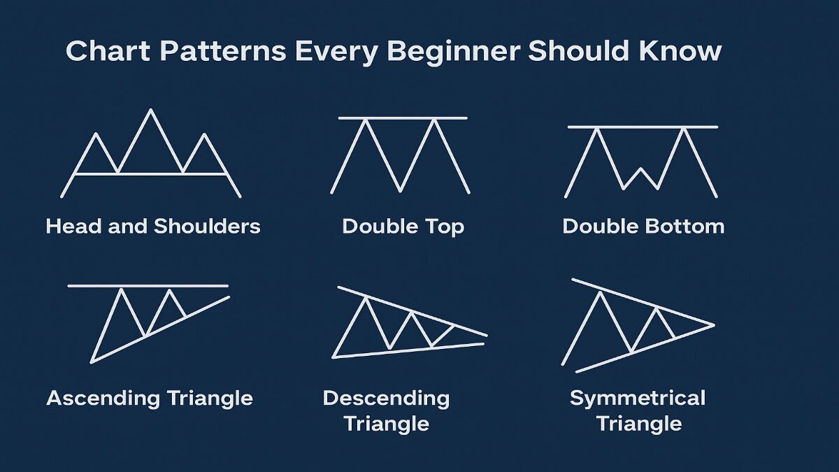
Patterns are like footprints of the market. They repeat again and again because human psychology never changes. If you recognize them, you can predict what might happen next.
Reversal Patterns
- Head and Shoulders: Looks like a head with two shoulders. Signals a possible trend reversal from bullish to bearish.
- Double Top: Two peaks at the same level → bearish signal.
- Double Bottom: Two lows at the same level → bullish signal.
Continuation Patterns
- Flags: Short pauses in a strong trend. Usually followed by continuation in the same direction.
- Pennants: Small symmetrical triangles that form during a strong move.
- Ascending Triangle: Shows that buyers are stronger. Usually breaks upward.
Breakouts and Fakeouts
- A breakout happens when price breaks a key support or resistance level with volume.
- A fakeout is when price breaks the level but quickly reverses, trapping traders.
Risk Management with Chart Reading
No matter how good you are at reading charts, if you don’t manage risk, you’ll eventually lose everything. Risk management is the shield that protects your trading capital.
Setting Stop-Loss and Take-Profit Levels
- Stop-Loss: A predefined level where you exit if the trade goes against you. Example: If you buy Bitcoin at ₹25,00,000, you may set a stop-loss at ₹24,00,000.
- Take-Profit: A level where you exit with profit. Example: If Bitcoin reaches ₹27,00,000, you close the trade.
Avoiding Emotional Trading
Emotions are a trader’s worst enemy. Fear makes you sell too early, greed makes you hold too long. Charts help you stay logical by setting rules before you trade.
Importance of Risk-to-Reward Ratio
A good trade has a risk-to-reward ratio of at least 1:2. This means if you risk ₹1,000, you aim to make ₹2,000. Even if half of your trades fail, you’ll still make a profit in the long run.
Smart traders don’t just look at charts to find entries—they also use charts to decide when to exit safely.
Also read: How to Start Investing in Crypto in India (2025 Guide)
Common Mistakes Beginners Make in Chart Reading
Learning to read cryptocurrency charts is exciting, but many beginners fall into the same traps. These mistakes can cost you money and confidence, so it’s important to recognize them early.
1. Overusing Indicators
One of the biggest mistakes is loading charts with too many indicators. Beginners think the more indicators they use, the more accurate the prediction. But the truth is, too many signals can confuse you and give contradictory results. A simple chart with a few key indicators is much more effective.
2. Ignoring Fundamental News
Charts are powerful, but they don’t exist in isolation. Crypto prices can move dramatically based on news—like government regulations, exchange hacks, or a major partnership announcement. A perfect chart setup can fail if unexpected news hits the market. Always combine technical analysis with fundamental analysis.
3. Chasing Trends Without Confirmation
Many beginners see a price rising and jump in without checking for confirmation. This often leads to buying at the peak just before a reversal. Instead, wait for confirmation signals—like strong volume, a breakout candle, or multiple indicators agreeing.
4. Forgetting About Risk Management
Even with perfect chart reading, every trade carries risk. Beginners often ignore stop-loss orders or put too much money into a single trade. This can wipe out your portfolio quickly. The smartest traders always risk only a small percentage of their capital per trade.
5. Trading with Emotions
Charts can show patterns, but emotions like fear and greed can override logic. Beginners often panic-sell during a dip or FOMO (fear of missing out) buy during a pump. The solution is discipline—stick to your analysis and strategy, not your feelings.
👉 Avoiding these mistakes will instantly put you ahead of many new traders.
Tools and Platforms for Reading Crypto Charts
Today, you don’t need to be a Wall Street professional with fancy tools. There are plenty of free and paid platforms where beginners can access detailed cryptocurrency charts. Choosing the right platform makes chart reading easier and more enjoyable.
Best Free Charting Platforms
- TradingView – The most popular tool for traders worldwide. It offers customizable charts, drawing tools, and hundreds of free indicators.
- CoinMarketCap – Great for beginners who just want simple price charts, market cap data, and volume information.
- Binance Exchange Charts – If you trade on Binance, you already have access to built-in candlestick charts and indicators.
Paid vs. Free Tools
- Free Tools: Perfect for beginners. They provide all the essential features you need to start learning.
- Paid Tools: Offer advanced features like backtesting, premium indicators, alerts, and more customization. These are useful once you become more experienced.
Mobile Apps for Quick Chart Reading
In today’s world, many traders use their phones to check charts on the go. Apps like TradingView Mobile, Binance, and KuCoin make it easy to monitor price action anywhere.
Also read: What is Cryptocurrency and How Does It Work?
Step-by-Step Guide to Reading Your First Crypto Chart
Now that we’ve covered all the basics, let’s walk through a simple step-by-step guide for reading your very first cryptocurrency price chart.
Step 1: Select a Coin and Timeframe
Choose a cryptocurrency (like Bitcoin or Ethereum) and open its chart. For beginners, start with a daily timeframe—it’s less noisy than shorter charts.
Step 2: Identify the Chart Type
Switch to candlestick charts for more detail. They show market psychology better than line charts.
Step 3: Spot the Trend
Look at the bigger picture. Is the coin moving upward, downward, or sideways? Draw trend lines if needed.
Step 4: Add Key Indicators
Apply basic indicators like RSI (to check overbought/oversold), MACD (for momentum), and Moving Averages (for trend direction).
Step 5: Check Volume
See if price movements are supported by strong volume. A breakout with high volume is more reliable than one with low volume.
Step 6: Mark Support and Resistance
Identify the levels where the price has repeatedly bounced (support) or been rejected (resistance). These are your decision points.
Step 7: Make a Trading Plan
Decide where you will enter, set a stop-loss to protect yourself, and place a take-profit target.
👉 Example: If Bitcoin is at ₹25,00,000 and you see a bullish breakout above resistance with high volume, you might enter at ₹25,20,000. Set your stop-loss at ₹24,50,000 and target ₹26,50,000.
This step-by-step approach ensures you’re not just guessing, but making logical, chart-based decisions.
Advanced Tips for Chart Reading
Once you’ve mastered the basics, it’s time to go deeper. Advanced chart reading doesn’t mean using complicated formulas; it means combining different techniques smartly. Here are some pro tips:
Also read: How Are ETFs Traded on Stock Exchanges?
1. Combine Technical and Fundamental Analysis
Charts show market psychology, but fundamentals show real-world impact. For example, if Ethereum is showing a bullish chart pattern but there’s news about a government ban, the pattern might fail. Always check news, regulations, and blockchain updates alongside charts.
2. Use Multiple Timeframes
Looking at a single chart can give a biased view. For example:
- On a 5-minute chart, Bitcoin might look bearish.
- On a daily chart, it may still be bullish.
Professional traders zoom out to confirm the bigger trend. This method is called multi-timeframe analysis. It prevents you from panicking on short-term moves.
3. Backtesting Your Strategy
Don’t just guess whether your strategy works—test it on past data. Most platforms like TradingView let you scroll back and check how your indicators and patterns would have performed. This builds confidence and helps you refine your trading style.
4. Focus on Risk Over Profits
Advanced traders understand that survival is more important than chasing quick gains. Even if you make small but consistent profits with low risk, you’ll grow steadily. This is how long-term traders succeed.
👉 The key takeaway: Don’t chase complexity. Instead, master the basics, stay disciplined, and combine tools smartly.
Conclusion
Learning how to read cryptocurrency price charts for beginners: a step-by-step guide is one of the most valuable skills you can develop as a trader or investor. Charts are not just colorful graphics—they are the language of the market. By reading them, you understand the emotions of buyers and sellers, spot opportunities, and manage risks.
Here’s a quick recap of what you’ve learned:
- Price charts tell the story of the market.
- Candlestick charts are the most powerful way to visualize crypto prices.
- Trends, support, and resistance are the building blocks of analysis.
- Indicators like RSI, MACD, and Moving Averages give extra confirmation.
- Volume shows the strength of any price move.
- Risk management ensures you survive long-term.
- Tools like TradingView and CoinMarketCap make chart reading accessible.
At first, charts may seem overwhelming, but with practice, they become second nature. Start small, practice daily, and never stop learning. Crypto markets move fast, but once you understand how to read charts, you’ll feel like you finally have a map in the wild jungle of trading.
FAQs
What is the easiest crypto chart for beginners?
The candlestick chart is the best choice. It shows price movements clearly, highlights market psychology, and is widely used by traders.
Can I trade crypto just by reading charts?
Technically yes, but it’s risky. The best traders combine technical analysis (charts) with fundamental analysis (news, technology, adoption).
How do I know if a trend is strong?
Look for higher volume supporting the trend. If Bitcoin is rising and volume is increasing, the trend is strong. If volume is low, it may be a fake move.
Which indicators are best for beginners?
Start with RSI, Moving Averages, and MACD. These three cover momentum, trend, and strength without overcomplicating your chart.
How long does it take to master chart reading?
It depends on practice. With consistent effort, most beginners become comfortable in 2–3 months. But true mastery requires continuous learning and experience.
Final Note
This guide on how to read cryptocurrency price charts for beginners: a step-by-step guide is designed to be your roadmap. Use it, practice it, and refine it. The more you practice, the more confident you’ll become.
Disclaimer: Moneyjack.in provides general financial information for educational purposes only. We are not financial advisors. Content is not personalized advice. Consult a qualified professional before making financial decisions. We are not liable for any losses or damages arising from the use of our content. Always conduct your own research.