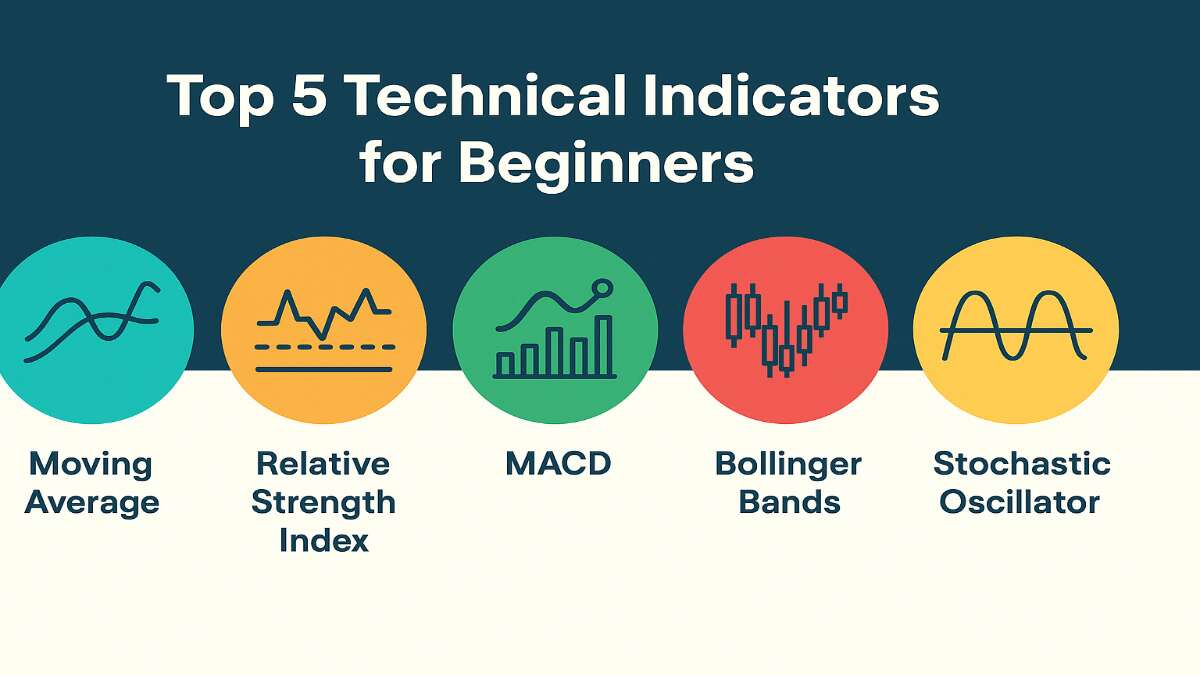
Trading in the stock market can feel overwhelming for beginners. With so many charts, price movements, and market trends, it is easy to get confused. That is why technical indicators are so important. In this article, we will cover the Top 5 Technical Indicators for Beginners in Trading in simple English, with examples, strategies, and practical uses.
If you are new to stock trading, this guide will help you understand how to use these tools step by step. Our focus is to explain each concept in easy, human-like language so that even first-time traders in India can follow along.
Table of Contents
What Are Technical Indicators?
Technical indicators are mathematical calculations based on stock prices and trading volume. They help traders predict the possible direction of a stock or market. By using them, beginners can identify entry and exit points, trends, and momentum more effectively.
For this article, we have selected the Top 5 Technical Indicators for Beginners in Trading that are most useful for learning and actual trading.
Top 5 Technical Indicators for Beginners
- Moving Averages (SMA & EMA)
- Relative Strength Index (RSI)
- Moving Average Convergence Divergence (MACD)
- Bollinger Bands
- Fibonacci Retracement
1.Moving Averages (SMA & EMA)
Introduction to Moving Averages
Moving Averages (MAs) are among the most widely used technical indicators in trading and investing. Whether you’re analyzing stocks, cryptocurrencies, or forex, moving averages help simplify complex price data by smoothing out fluctuations and highlighting the underlying trend.Top 5 Technical Indicators
At their core, moving averages are designed to reduce market noise. Instead of reacting to every price spike or dip, they allow traders to focus on the bigger picture. By averaging price data over a set period, moving averages help identify whether an asset is trending upward, downward, or sideways.
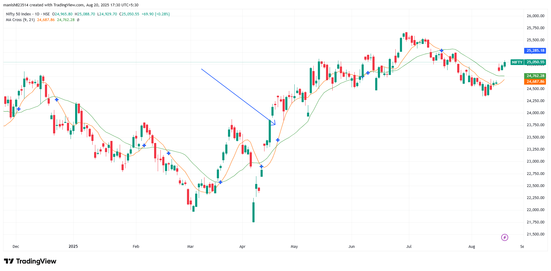
Traders rely on moving averages for multiple purposes: identifying trends, confirming signals from other indicators, and generating trade entry/exit points. Among the different types of moving averages, two of the most popular are the Simple Moving Average (SMA) and the Exponential Moving Average (EMA). Both aim to smooth price data, but they do so in different ways, which makes each one suitable for different market conditions and trading styles.
Understanding SMA and EMA in detail will not only improve your technical analysis skills but also help you make more informed trading decisions.learn Top 5 Technical Indicators
Also read: TCS Share Price Target 2026, 2027, 2030, 2040, 2050
Understanding the Basics of SMA and EMA
Before diving into calculations, let’s break down the two main types of moving averages:
- Simple Moving Average (SMA):
SMA is the straightforward average of prices over a specific period. For example, a 10-day SMA adds up the closing prices of the last 10 days and divides them by 10. It gives equal weight to each day’s price. - Exponential Moving Average (EMA):
EMA gives more weight to recent prices, making it more sensitive to recent price changes. Unlike SMA, which treats all data points equally, EMA emphasizes the most current data, which helps traders capture trends faster.
Both SMA and EMA are plotted as lines on a price chart. Traders use them to spot trends, reversals, and potential entry/exit points. While SMA is smoother and less reactive, EMA responds more quickly, making it ideal for short-term trading.
How SMA is Calculated
The Simple Moving Average (SMA) is calculated using a straightforward formula:
SMA = (P1 + P2 + P3 + … + Pn) / n
Where:
- Pn = price at a given time period
- n = number of time periods
Example: Let’s say you want to calculate a 5-day SMA for a stock with the following closing prices:
- Day 1 = $50
- Day 2 = $52
- Day 3 = $54
- Day 4 = $53
- Day 5 = $55
SMA = (50 + 52 + 54 + 53 + 55) / 5 = 264 / 5 = 52.8
So, the 5-day SMA is 52.8.
This value is then plotted on the chart, and as new days’ prices come in, the SMA shifts forward, creating a smooth line.
The longer the period (e.g., 200-day SMA), the smoother and slower the line. Shorter periods (e.g., 10-day SMA) create faster and more sensitive lines.learn Top 5 Technical Indicators
Also read: Bharti Airtel Share Price Target 2026,2027,2030,2040,2050
How EMA is Calculated
The Exponential Moving Average (EMA) uses a more complex formula that assigns higher weight to recent prices:
EMA = (Price_today × Multiplier) + (EMA_yesterday × (1 – Multiplier))
Where:
- Multiplier = 2 / (n + 1)
- n = number of time periods
Example: Suppose you want a 5-day EMA for the same stock with closing prices of 50, 52, 54, 53, 55.
Step 1: Calculate the multiplier → 2 / (5 + 1) = 0.333
Step 2: Take the SMA of the first 5 days (which we already calculated = 52.8) as the initial EMA.
Step 3: Apply the formula for Day 6 and onwards.
So, if Day 6 closing price = 56:
EMA = (56 × 0.333) + (52.8 × 0.667) = 18.648 + 35.23 = 53.88
The EMA line will adjust more quickly to price changes compared to the SMA, making it useful in fast-moving markets.
SMA vs. EMA: Key Differences
While both SMA and EMA are designed to smooth price data, they differ in responsiveness and application.
| Feature | SMA (Simple Moving Average) | EMA (Exponential Moving Average) |
|---|---|---|
| Calculation | Equal weight to all prices | More weight to recent prices |
| Sensitivity | Slower, less reactive | Faster, more reactive |
| Best Use | Long-term trends | Short-term trading |
| Advantages | Stable, less affected by noise | Quick response to new trends |
| Drawbacks | May lag in volatile markets | May give false signals in choppy markets |
Why Moving Averages Matter in Trading
Moving averages are not just fancy lines on a chart—they are essential tools for filtering out market noise and spotting genuine trends. In financial markets, price moves can be erratic, with sudden spikes or drops caused by news, rumors, or short-term trading activities. By applying moving averages, traders can cut through this chaos and focus on the overall direction.
One of the biggest advantages of moving averages is their ability to act as dynamic support and resistance levels. For example, when the price is trending above a long-term moving average like the 200-day SMA, many traders see it as a bullish sign. On the other hand, if the price breaks below it, it often signals potential bearish momentum.learn Top 5 Technical Indicators
Moving averages also help traders time their entries and exits. For instance, when a short-term EMA crosses above a long-term SMA (known as the Golden Cross), it’s a bullish signal. Conversely, when a short-term EMA crosses below a long-term SMA (the Death Cross), it’s often viewed as bearish.
Beyond spotting trends, moving averages smoothen out volatile data, making it easier for traders to make rational decisions rather than reacting emotionally to every price movement. Whether you’re a day trader, swing trader, or long-term investor, moving averages are valuable companions in technical analysis.learn Top 5 Technical Indicators
Also read: SBI Bank Share Price Target 2026, 2027, 2030, 2040, 2050
Types of Moving Averages by Time Frame
Different traders use different moving average periods depending on their trading style. Here are the most common time frames:
1. Short-term Moving Averages
- Typically 10-day, 20-day, or 30-day SMAs/EMAs
- React quickly to price changes
- Best suited for short-term traders and scalpers
- Provide early trend signals but can also generate false alarms in choppy markets
2. Medium-term Moving Averages
- Typically 50-day or 100-day
- Balance between quick reaction and stability
- Often used by swing traders to capture medium trends
- Less sensitive than short-term but still responsive enough for active traders
3. Long-term Moving Averages
- Typically 200-day SMA
- Widely followed by institutional traders and investors
- Helps identify the broader trend direction
- Acts as a strong support/resistance level
- Best for investors who want to filter out short-term noise
By combining different time frames, traders can analyze both short-term momentum and long-term market direction. For instance, a trader may use a 20-day EMA for short-term entries while relying on a 200-day SMA for overall trend confirmation.
How to Interpret Moving Average Signals
Reading moving averages isn’t just about watching lines move across a chart. Traders interpret them in specific ways to make informed decisions:
1. Price Above or Below Moving Average
- If price stays above the moving average, it’s often considered bullish.
- If price stays below, it signals bearish conditions.
2. Golden Cross and Death Cross
- Golden Cross: A short-term MA (like 50-day) crosses above a long-term MA (like 200-day) → strong bullish signal.
- Death Cross: A short-term MA crosses below a long-term MA → bearish signal.
These signals are widely watched, especially in the stock market. For example, when Bitcoin’s 50-day EMA crossed above its 200-day SMA in 2020, it marked the beginning of a massive bull run. Top 5 Technical Indicators
3. Slope of the Moving Average
- If the slope of the moving average is upward, it suggests a strong uptrend.
- If it’s downward, it points to a bearish trend.
- A flat slope indicates sideways or range-bound movement.
Popular Moving Average Strategies
Moving averages become most powerful when used as part of a trading strategy. Here are some widely adopted ones:
1. Moving Average Crossover Strategy
- Involves using two MAs (short-term and long-term).
- When the short-term crosses above the long-term → buy signal.
- When the short-term crosses below the long-term → sell signal.
- Works best in trending markets, but can give false signals in sideways conditions.
2. Moving Averages with RSI (Relative Strength Index)
- Traders use RSI to confirm moving average signals.
- Example: If EMA gives a bullish signal but RSI shows overbought conditions, the trader may wait before entering.
3. Moving Averages with MACD (Moving Average Convergence Divergence)
- MACD itself is based on moving averages (12-day EMA and 26-day EMA).
- Traders often combine MACD crossovers with price moving above/below SMA for stronger confirmation.
Practical Examples with SMA & EMA
Moving averages are versatile and can be applied across different markets:
1. Stock Market
- Long-term investors watch the 200-day SMA to gauge overall market health.
- Short-term traders use 20-day EMAs for quick entry and exit signals.
2. Cryptocurrency Trading
- EMA is especially popular in crypto due to high volatility.
- Traders use the 9-day and 21-day EMA combination to spot early trend shifts.
3. Forex Market
- Forex traders often rely on moving averages to confirm breakout trades.
- For example, if EUR/USD breaks above its 50-day SMA with strong momentum, traders may see it as a bullish sign.
Advantages of SMA and EMA
Both SMA and EMA come with unique strengths, making them indispensable tools for traders across different markets.
Advantages of SMA (Simple Moving Average):
- Simplicity: SMA is easy to calculate and understand, making it beginner-friendly.
- Stability: Since it smooths price action, it filters out short-term volatility.
- Long-Term Trend Identification: The 200-day SMA, in particular, is one of the most respected indicators in financial markets.
- Widely Followed: Because many investors track it, SMA levels often act as self-fulfilling support and resistance zones.
Advantages of EMA (Exponential Moving Average):
- Faster Response: EMA reacts more quickly to price changes, making it ideal for fast-moving markets.
- Early Signal Detection: Short-term EMAs can catch new trends earlier than SMAs.
- Better for Volatile Assets: EMA is more effective in crypto and forex markets, where price swings are rapid.
- Popular Among Day Traders: Its sensitivity makes it useful for quick trading decisions.
Both moving averages shine when used in the right context. For example, long-term investors prefer SMA for stability, while short-term traders lean on EMA for quick responses.learn Top 5 Technical Indicators
Also read: Kotak Mahindra Bank Share Price Target 2026, 2027, 2030, 2040, 2050
Limitations of Moving Averages
While moving averages are powerful, they are not flawless. Traders must understand their limitations:
- Lagging Nature: Both SMA and EMA are based on past price data, which means they always lag behind actual price action.
- False Signals in Sideways Markets: In range-bound conditions, moving averages can generate multiple misleading signals.
- Over-Reliance Risk: Using moving averages alone without confirming indicators (like RSI or MACD) can lead to poor decisions.
- Whipsaws: In highly volatile markets, EMA especially can give many false entries and exits.
The key is not to discard moving averages but to use them wisely. They should complement other tools in a trader’s strategy rather than being the sole decision-maker.learn Top 5 Technical Indicators
SMA & EMA Comparison Table
To make the differences clearer, here’s a side-by-side comparison:
| Feature | SMA (Simple Moving Average) | EMA (Exponential Moving Average) |
|---|---|---|
| Weighting | Equal weight to all price points | More weight to recent price points |
| Responsiveness | Slower, less sensitive | Faster, more sensitive |
| Best Use | Long-term trend analysis | Short-term trading |
| Advantages | Stable, filters noise | Captures trends early |
| Disadvantages | Lags in fast markets | Can give false signals in sideways moves |
| Common Periods | 50-day, 200-day | 9-day, 21-day, 50-day |
This table highlights why many traders combine both SMA and EMA in their strategies—they balance out each other’s strengths and weaknesses.learn Top 5 Technical Indicators
Best Practices for Using SMA & EMA
If you want to get the most out of moving averages, here are some expert tips:
- Combine with Other Indicators: Use RSI, MACD, or volume indicators to confirm moving average signals.
- Backtest Your Strategy: Always test your moving average strategy on historical data before applying it live.
- Match with Your Trading Style:
- Day traders → use short-term EMAs.
- Swing traders → use 20-day or 50-day averages.
- Long-term investors → rely on 200-day SMA.
- Adjust According to Market Conditions: In trending markets, moving averages perform well. In choppy markets, reduce reliance on them.
- Risk Management: Never depend solely on moving averages—use stop-losses and position sizing to protect your capital.
Conclusion
Moving Averages—whether SMA or EMA—are fundamental tools in technical analysis. They simplify price action, reveal trends, and help traders make better decisions. SMA offers stability and clarity for long-term analysis, while EMA provides speed and sensitivity for short-term trading.learn Top 5 Technical Indicators
However, no moving average is perfect. They lag behind price and can give false signals, especially in sideways markets. The secret lies in using them wisely—combine them with other indicators, choose periods suited to your trading style, and apply sound risk management.learn Top 5 Technical Indicators
Ultimately, moving averages act like a trader’s compass. They don’t guarantee success, but they guide you toward better-informed decisions, helping you navigate the ever-changing landscape of financial markets.learn Top 5 Technical Indicators
2.Relative Strength Index (RSI) Explained in Detail
Introduction to RSI
The Relative Strength Index (RSI) is one of the most popular momentum indicators in technical analysis. It helps traders measure the speed and strength of price movements, making it easier to spot potential reversals, confirm trends, and time entry or exit points.
RSI moves between 0 and 100, with certain levels signaling whether an asset is overbought (potentially too expensive) or oversold (potentially undervalued). Traditionally, readings above 70 suggest overbought conditions, while readings below 30 indicate oversold conditions.learn Top 5 Technical Indicators
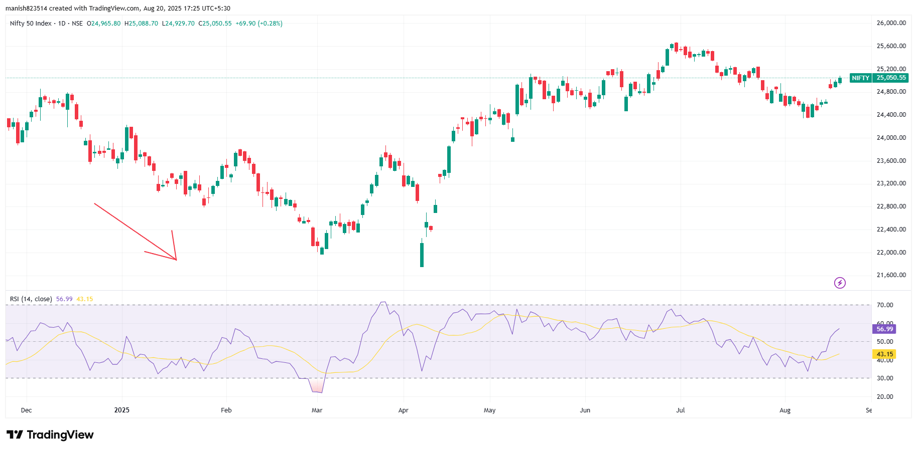
What makes RSI powerful is its simplicity. With just one glance, traders can determine whether the market is overheated or due for a rebound. Unlike complex technical tools, RSI provides quick, actionable insights that both beginners and experienced traders use daily.
Also read: ICICI Bank Share Price Target 2026, 2027, 2030, 2040, 2050
History and Origin of RSI
The RSI was developed by J. Welles Wilder Jr. and introduced in his 1978 book New Concepts in Technical Trading Systems. Wilder, a mechanical engineer turned technical analyst, created several widely used indicators such as the Average True Range (ATR), Parabolic SAR, and Directional Movement Index (DMI).
Wilder designed RSI to address a key challenge traders faced: how to measure momentum in a clear, standardized way. Before RSI, traders often relied on raw price changes, which were harder to interpret. RSI offered a mathematical method to quantify whether an asset was overbought or oversold, making it an immediate success among traders.
Over time, RSI evolved from being a simple momentum tool into a cornerstone of modern technical analysis. Today, it’s built into virtually every trading platform and applied across stocks, forex, commodities, and cryptocurrencies.learn Top 5 Technical Indicators
The Concept Behind RSI
At its core, RSI measures the relative strength of upward vs. downward movements in price. Instead of just tracking direction, RSI evaluates how strong those moves are.
Think of it like a tug-of-war:
- When buyers dominate, RSI rises toward 70–100.
- When sellers dominate, RSI falls toward 0–30.
- When balance exists, RSI hovers near the middle (50).
This makes RSI more than just a trend indicator—it’s a momentum gauge. While price alone shows direction, RSI shows the intensity behind that direction. A rising price with weak RSI might signal a fragile rally, whereas a strong RSI uptrend suggests robust buying power.learn Top 5 Technical Indicators
This concept allows traders to anticipate potential reversals before they appear on price charts.
How RSI is Calculated
RSI calculation may look complicated at first, but the logic is straightforward. The formula is:
RSI = 100 – [100 / (1 + RS)]
Where:
- RS (Relative Strength) = Average Gain / Average Loss
- The standard period is 14 days (but traders often adjust this).
Step-by-Step Example:
Suppose over 14 days, a stock gains on 9 days and loses on 5 days.
- Average Gain = 1.5%
- Average Loss = 1.0%
RS = 1.5 ÷ 1.0 = 1.5
RSI = 100 – [100 / (1 + 1.5)]
= 100 – [100 / 2.5]
= 100 – 40
= 60
This RSI reading of 60 means momentum is bullish but not yet overbought.
RSI Scale and Levels
RSI moves within a range of 0 to 100, but traders focus on key levels:
- Above 70 → Overbought: Price may be too high and due for correction.
- Below 30 → Oversold: Price may be too low and due for rebound.
- Around 50 → Neutral Zone: No strong buying or selling pressure.
Some traders adjust these levels for different markets:
- In strong bull markets, overbought can be set at 80, and oversold at 20.
- In sideways markets, the traditional 70/30 thresholds work best.
How RSI Works in Technical Analysis
RSI is more than just a number between 0 and 100—it’s a window into market psychology. Traders use it to spot potential bullish and bearish conditions as well as neutral or sideways moves.learn Top 5 Technical Indicators
1. Bullish Signals
- When RSI climbs from oversold territory (below 30) and moves upward, it often signals that buyers are stepping back in.
- If RSI stays above 50 for an extended period, it usually confirms that an uptrend is strong.
- Bullish divergences occur when price makes new lows, but RSI makes higher lows—indicating weakening selling pressure and potential reversal.
2. Bearish Signals
- When RSI rises above 70, it indicates overbought conditions, suggesting the asset may be due for a correction.
- If RSI remains below 50 consistently, it confirms bearish momentum.
- Bearish divergences happen when price makes new highs, but RSI fails to do the same—often a warning that buyers are losing steam.
3. Neutral Conditions
- When RSI hovers around 50, it shows balance between buyers and sellers.
- In sideways markets, RSI often fluctuates between 40–60 without strong signals.
By combining these signals, traders can gauge not just where the market is, but where it might be heading.
Also read: Best Websites for Stock Market Research
Key Features of RSI Indicator
RSI has certain characteristics that make it unique compared to other indicators:
- Momentum Tracking: RSI measures the strength of price moves, not just direction.
- Divergences: One of RSI’s most valuable features is its ability to spot divergences between price and momentum.
- Leading Indicator Potential: While most technical tools lag behind price, RSI can sometimes provide early warnings of trend reversals.
- Adaptability: The default setting is 14 periods, but traders often adjust RSI to 7 (more sensitive) or 21 (less sensitive), depending on their style.
These features make RSI versatile and suitable for both short-term and long-term strategies.
Advantages of Using RSI
RSI is one of the most widely used indicators for good reason. Here are its main benefits:
- Simplicity: Easy to read and interpret, even for beginners.
- Works Across Markets: Equally effective in stocks, forex, crypto, and commodities.
- Timing Entries and Exits: Helps traders buy near bottoms (oversold) and sell near tops (overbought).
- Identifies Hidden Strength/Weakness: Divergences often reveal market shifts before price confirms them.
- Complements Other Indicators: Works well with moving averages, MACD, or support/resistance analysis.
Because of these advantages, RSI has become a go-to indicator for both novice and professional traders.
Limitations of RSI
Despite its usefulness, RSI is not perfect. Traders should be aware of its limitations:
- False Signals in Strong Trends: In powerful bull runs, RSI may stay overbought for weeks without reversing. Similarly, in strong downtrends, it can remain oversold for long periods.
- Lagging in Sideways Markets: In range-bound conditions, RSI can produce frequent whipsaws.
- Over-Reliance Risk: Many beginners misuse RSI by treating every overbought/oversold reading as a reversal signal. In reality, context matters.
- Sensitivity to Period Selection: Shorter RSI periods give quicker signals but are more prone to noise, while longer periods are slower but more stable.
The takeaway? RSI should never be used alone—it works best when combined with other technical tools.
RSI vs. Other Indicators
To better understand RSI, let’s compare it with some other popular indicators:
| Indicator | What It Measures | Strengths | Weaknesses |
|---|---|---|---|
| RSI | Momentum of price movements | Simple, highlights overbought/oversold levels | Can stay extreme in strong trends |
| Stochastic Oscillator | Compares closing price to price range over time | Sensitive, good for short-term trading | More prone to false signals |
| MACD | Relationship between two EMAs | Great for trend-following | Lagging, slower than RSI |
| Moving Averages | Average price over time | Good for trend confirmation | Do not measure momentum |
This table shows why RSI is often paired with other tools—it brings momentum insights that other indicators lack.learn Top 5 Technical Indicators
How to Interpret RSI Signals
Correctly interpreting RSI is key to making profitable trades. Here’s how traders typically use it:
- Overbought/Oversold Levels:
- RSI above 70 → possible overbought, watch for corrections.
- RSI below 30 → possible oversold, watch for rebounds.
- Divergences:
- Bullish Divergence: Price makes lower lows, but RSI makes higher lows → possible upward reversal.
- Bearish Divergence: Price makes higher highs, but RSI makes lower highs → possible downward reversal.
- Trend Confirmation:
- RSI above 50 → confirms bullish trend.
- RSI below 50 → confirms bearish trend.
Popular RSI Trading Strategies
RSI is versatile—it can be used in many different ways depending on a trader’s style. Here are some of the most common and effective RSI strategies:
1. Overbought/Oversold Strategy
- When RSI falls below 30 → the asset may be oversold → potential buy opportunity.
- When RSI rises above 70 → the asset may be overbought → potential sell opportunity.
- This is the most basic RSI strategy, often used in range-bound markets.
2. RSI Divergence Strategy
- Bullish Divergence: Price makes lower lows, but RSI makes higher lows → signals weakening selling pressure → possible reversal upward.
- Bearish Divergence: Price makes higher highs, but RSI makes lower highs → signals weakening buying pressure → possible reversal downward.
- Divergence signals are powerful because they often appear before the actual price reversal.
3. RSI with Moving Averages
- Traders often combine RSI with moving averages for stronger signals.
- Example: If RSI shows overbought, but the price is still above the 50-day SMA, traders may wait for confirmation before selling.
- This helps avoid false signals, especially in strong trending markets.
4. RSI Trendline Breaks
- Just like price charts, RSI itself can form trendlines.
- When RSI breaks its own trendline, it can signal an early market shift.
- Example: If RSI breaks above a downtrend line, it may confirm bullish momentum.
These strategies show that RSI is not just a standalone tool but becomes more powerful when used in combination with other techniques.
Also read: HDFC Bank Share Price Target 2026, 2030, 2040, 2050
Practical Examples of RSI in Action
To better understand RSI, let’s see how it works in different markets:
1. Stock Market Example
Suppose Apple (AAPL) has been rising for weeks, and RSI crosses 75. This suggests overbought conditions. Traders might wait for a pullback before entering new positions. If RSI then falls below 70 while the price stalls, it could signal a short-term correction.
2. Cryptocurrency Example
Bitcoin (BTC) is known for volatile moves. When BTC’s RSI dropped below 25 during a crash, it signaled extreme oversold conditions. Traders who bought at that point often caught significant rebounds when RSI returned to neutral levels.
3. Forex Example
In the EUR/USD pair, RSI may stay above 70 during a strong uptrend. Instead of selling immediately, professional traders look for bearish divergence (price rising but RSI falling) before confirming a potential reversal.
These real-world examples show how RSI can help traders across markets make more informed decisions.learn Top 5 Technical Indicators
RSI Comparison Table
Here’s a quick breakdown of RSI readings and their typical interpretations:
| RSI Level | Market Condition | Trading Signal |
|---|---|---|
| 0 – 30 | Oversold | Possible Buy Opportunity |
| 30 – 50 | Weak Bearish | Watch for further downside |
| 50 – 70 | Bullish Momentum | Possible Buy/Trend Continuation |
| 70 – 100 | Overbought | Possible Sell Opportunity |
This table simplifies RSI interpretation, helping traders quickly assess market conditions.
Best Practices When Using RSI
To maximize RSI’s effectiveness, traders should follow some best practices:
- Don’t Use RSI Alone: Combine it with moving averages, MACD, or support/resistance for confirmation.
- Adjust the RSI Period: The default setting is 14 periods, but shorter (7) is more sensitive and longer (21) is more stable.
- Know the Market Type: RSI works better in range-bound markets than in strong trends. Adjust your interpretation accordingly.
- Look for Divergences: Divergences often provide stronger signals than simple overbought/oversold levels.
- Risk Management: Always use stop-loss orders and position sizing to manage potential losses.
By following these practices, traders can avoid common pitfalls and make smarter decisions with RSI.
Conclusion
The Relative Strength Index (RSI) is one of the most reliable momentum indicators in technical analysis. It provides insights into whether an asset is overbought, oversold, or trading in a neutral zone. By analyzing RSI readings and divergences, traders can anticipate potential reversals, confirm trends, and refine their entry and exit strategies.
However, like all indicators, RSI is not perfect. It can generate false signals, especially in strong trending markets. The best way to use RSI is in combination with other indicators and strong risk management strategies.
When used correctly, RSI acts as a trader’s early warning system, helping to spot hidden shifts in momentum before they appear on price charts.learn Top 5 Technical Indicators
3.Moving Average Convergence Divergence (MACD)
Introduction to MACD
The Moving Average Convergence Divergence (MACD) is one of the most widely used technical indicators for analyzing market trends and momentum. Unlike simple moving averages, which only show trend direction, MACD provides deeper insights by combining trend-following and momentum analysis into one tool.

MACD helps traders identify potential buy and sell opportunities by showing the relationship between two moving averages of price. It can highlight whether momentum is strengthening, weakening, or reversing. This makes it useful in stocks, forex, crypto, and commodities trading.
One of MACD’s strengths is that it adapts to different timeframes. Day traders can use it for short-term signals, while long-term investors rely on it for trend confirmation. Its flexibility and reliability are why MACD remains a core tool in modern trading strategies.
Also read: Infosys Share Price Target 2026, 2027, 2030, 2040, 2050
History and Origin of MACD
The MACD indicator was developed by Gerald Appel in the late 1970s. Appel wanted to create an indicator that could combine trend-following characteristics with momentum analysis to give traders clearer buy and sell signals.
Originally, MACD was applied mostly in stock trading, where traders used it to confirm trends and spot potential reversals. Over the years, with the rise of computer-based charting, MACD became a global standard in technical analysis and is now built into nearly every trading platform.
Today, MACD is not only popular among retail traders but also institutional investors who use it for portfolio management and timing strategies.
The Concept Behind MACD
The MACD works on the principle of tracking the relationship between two moving averages—typically the 12-period EMA and the 26-period EMA.
- When these moving averages converge (move closer together), it signals weakening momentum.
- When they diverge (move apart), it signals strengthening momentum.
This convergence and divergence provide insights into whether a trend is gaining strength or losing steam. By also including a 9-period EMA (signal line), traders get clearer buy/sell signals when the MACD line crosses above or below it.
The addition of the MACD histogram further enhances the indicator, showing the difference between the MACD line and the signal line, making it easier to visualize momentum changes.
Also read: Best Platforms to Invest in Government and Corporate Bonds
How MACD is Calculated
MACD is composed of three elements:
- MACD Line = 12-period EMA – 26-period EMA
- Shows the difference between short-term and long-term momentum.
- Signal Line = 9-period EMA of MACD Line
- Smooths out signals and helps generate buy/sell triggers.
- Histogram = MACD Line – Signal Line
- Represents momentum visually—positive when MACD is above signal line, negative when below.
Example:
- If the 12-day EMA is 50 and the 26-day EMA is 45 → MACD Line = 5.
- If the 9-day EMA of the MACD Line = 3 → Histogram = 5 – 3 = +2 (bullish momentum).
This calculation allows traders to quickly spot changes in momentum and trend direction.
Understanding MACD Components
To fully use MACD, traders must understand its three parts:
- MACD Line: Measures the difference between short-term and long-term EMAs.
- Signal Line: Acts as a trigger—when MACD crosses above it, it’s bullish; when it crosses below, it’s bearish.
- Histogram: Visual representation of momentum. Rising histogram bars suggest stronger momentum, while falling bars indicate weakening momentum.
Together, these three components make MACD one of the most complete indicators available.
How MACD Works in Technical Analysis
MACD provides three primary types of trading signals:
1. Bullish Signals
- MACD line crosses above the signal line → buy signal.
- Histogram turns positive → momentum is shifting upward.
- MACD rises above zero → strong bullish trend confirmation.
2. Bearish Signals
- MACD line crosses below the signal line → sell signal.
- Histogram turns negative → momentum shifting downward.
- MACD falls below zero → bearish trend confirmation.
3. Neutral Signals
- When MACD and signal line are close together, it suggests sideways or low-momentum conditions.
- Traders may avoid entering trades until a clearer trend emerges.
Key Features of MACD Indicator
The Moving Average Convergence Divergence (MACD) has several unique features that make it one of the most powerful tools in technical analysis:
- Combination of Trend and Momentum: Unlike moving averages that only follow trends, MACD also measures momentum, making it a two-in-one indicator.
- Dynamic Adaptability: Works across different timeframes and markets—whether stocks, forex, or cryptocurrencies.
- Clear Visual Signals: The histogram makes it easy to spot changes in momentum at a glance.
- Leading and Lagging Capabilities: While primarily a lagging indicator, MACD divergences can act as early warnings for potential reversals.
- Universally Available: It’s built into nearly every trading platform, making it accessible for beginners and professionals alike.
These features explain why MACD has stood the test of time as a go-to technical indicator.
Also read: Reliance Industries Share Price Target 2026, 2027, 2030, 2040 & 2050
Advantages of Using MACD
MACD provides multiple benefits for traders who know how to use it effectively:
- Simplicity: Easy to read with crossovers and histograms.
- Versatility: Works for both short-term trades and long-term trend confirmation.
- Momentum Confirmation: Helps identify whether a trend is gaining or losing strength.
- Trend Reversal Warnings: Divergences between price and MACD often warn of upcoming reversals.
- Applicability Across Markets: Effective in stocks, forex, crypto, and commodities.
- Customizable Settings: Traders can adjust EMA lengths for faster or slower signals.
Because of these advantages, MACD is a favorite among both day traders and long-term investors.
Limitations of MACD
Despite its strengths, MACD also has some limitations that traders should be aware of:
- Lagging Nature: Since MACD is based on moving averages, it tends to lag behind price.
- False Signals in Sideways Markets: In ranging markets, MACD may produce frequent whipsaws.
- No Overbought/Oversold Levels: Unlike RSI, MACD doesn’t provide clear boundaries for extreme conditions.
- Depends on Settings: Default settings (12, 26, 9) may not work equally well in all markets or timeframes.
- Needs Confirmation: Using MACD alone can be risky—it works best when combined with other indicators.
Understanding these drawbacks helps traders avoid misuse and improve accuracy.learn Top 5 Technical Indicators
MACD vs. Other Indicators
To understand where MACD stands among other indicators, let’s compare it with a few popular ones:
| Indicator | What It Measures | Strengths | Weaknesses |
|---|---|---|---|
| MACD | Trend + Momentum | Clear signals via crossovers & histograms | Lags in sideways markets |
| RSI | Overbought/Oversold momentum | Great for spotting reversals | Can stay extreme in strong trends |
| Moving Averages | Average trend direction | Smooths price action | No momentum measurement |
| Stochastic Oscillator | Price relative to range | Very sensitive, good for short-term trading | Prone to false signals |
This comparison shows that while MACD is powerful, it’s most effective when combined with indicators like RSI for deeper insights.
How to Interpret MACD Signals
Traders interpret MACD using three key methods:
1. Crossovers
- Bullish Crossover: MACD line crosses above the signal line → buy signal.
- Bearish Crossover: MACD line crosses below the signal line → sell signal.
2. Divergences
- Bullish Divergence: Price makes lower lows, but MACD makes higher lows → trend may reverse upward.
- Bearish Divergence: Price makes higher highs, but MACD makes lower highs → trend may reverse downward.
3. Zero-Line Cross
- When MACD crosses above zero → confirms bullish momentum.
- When MACD crosses below zero → confirms bearish momentum.
Popular MACD Trading Strategies
MACD is not just a theoretical tool—it’s widely applied in practical trading strategies:
1. MACD Crossover Strategy
- Traders buy when MACD crosses above the signal line and sell when it crosses below.
- Works well in trending markets.
2. MACD and RSI Combination
- RSI provides overbought/oversold levels while MACD confirms trend direction.
- This combination reduces false signals.
3. MACD Histogram Momentum Trading
- Traders watch for increasing histogram bars as signs of strong momentum.
- Decreasing bars signal weakening momentum, often before price reacts.
Practical Examples of MACD in Action
To fully understand MACD, let’s look at how it works in real markets:
1. Stock Market Example
Suppose Apple (AAPL) has been trending upward. The MACD line crosses above the signal line, while the histogram starts showing taller positive bars. This confirms strong bullish momentum. A trader might enter a buy trade and stay invested until the MACD line eventually crosses below the signal line.
2. Cryptocurrency Example
Bitcoin (BTC) is highly volatile, making MACD useful for spotting momentum shifts. During a bullish rally, the MACD histogram may show increasing green bars. But if the histogram starts shrinking while price continues upward, it signals weakening momentum—an early warning of a possible correction.
3. Forex Example
In the EUR/USD pair, the MACD line crosses below the signal line, indicating bearish momentum. Shortly after, the MACD dips below the zero line, confirming a strong downtrend. Traders might use this as a signal to short the pair or avoid long positions.
These examples demonstrate how MACD helps traders confirm entries, manage exits, and avoid false moves.
MACD Comparison Table
Here’s a quick reference table showing how different MACD readings are interpreted:
| MACD Reading | Signal Type | Interpretation |
|---|---|---|
| MACD line > Signal line | Bullish crossover | Possible buy opportunity |
| MACD line < Signal line | Bearish crossover | Possible sell opportunity |
| Histogram rising above zero | Strong bullish momentum | Trend strengthening |
| Histogram falling below zero | Strong bearish momentum | Trend weakening |
| Bullish Divergence | Reversal signal | Price may rise soon |
| Bearish Divergence | Reversal signal | Price may fall soon |
This table makes it easy for traders to quickly interpret MACD conditions.
Best Practices for Using MACD
While MACD is powerful, it delivers the best results when used wisely:learn Top 5 Technical Indicators
- Combine with Other Indicators: Use RSI or support/resistance levels to confirm signals.
- Adjust Settings to Market: Default (12, 26, 9) works for most assets, but shorter EMAs suit volatile markets like crypto.
- Focus on Divergences: Divergences often warn of reversals before they appear on price charts.
- Avoid Choppy Markets: MACD produces false signals in sideways ranges—use it in trending conditions.
- Apply Risk Management: Always pair MACD signals with stop-loss and position sizing strategies.
By following these best practices, traders improve accuracy and avoid common pitfalls.
Conclusion
The Moving Average Convergence Divergence (MACD) is a versatile and powerful tool that combines both trend-following and momentum analysis. With its three main components—the MACD line, signal line, and histogram—it provides traders with a clear picture of momentum shifts, trend strength, and potential reversals.
Its strengths lie in simplicity, adaptability, and universal availability across trading platforms. However, traders must be cautious about its lagging nature and susceptibility to false signals in sideways markets.learn Top 5 Technical Indicators
The best way to use MACD is to combine it with other indicators like RSI, moving averages, or support/resistance levels. When applied correctly, MACD can significantly improve decision-making and help traders maximize profits while minimizing risks.
4.Bollinger Bands
Introduction to Bollinger Bands
Bollinger Bands are one of the most popular technical analysis tools used to measure volatility and identify potential price action opportunities. Invented in the 1980s by financial analyst John Bollinger, these bands have become a staple for traders in stocks, forex, cryptocurrencies, and commodities.
At their core, Bollinger Bands consist of a middle moving average line and two outer bands that expand and contract based on market volatility. When volatility rises, the bands widen. When volatility falls, the bands contract. This makes Bollinger Bands extremely adaptive to market conditions, unlike static indicators.

Traders use Bollinger Bands to spot breakouts, overbought and oversold conditions, and trend continuation signals. Because they combine moving averages with volatility, they provide a balanced view of the market that helps traders make more informed decisions.
Also read: Top 5 Dividend Paying Stocks in India 2025
History and Origin of Bollinger Bands
The Bollinger Bands indicator was created by John Bollinger, a financial analyst and trader, in the early 1980s. At the time, traders relied on fixed-width trading bands, but Bollinger realized that such bands failed to account for changing market volatility.
His innovation was to create a band that adjusts automatically based on standard deviations from a moving average. This dynamic approach allowed traders to better capture real-time market conditions.
Since then, Bollinger Bands have been widely adopted by both retail and institutional traders. They are now integrated into virtually every trading platform, making them accessible to traders across all markets.learn Top 5 Technical Indicators
The Concept Behind Bollinger Bands
The central idea of Bollinger Bands is that prices tend to stay within the upper and lower bands most of the time. The distance between these bands is determined by volatility:
- High volatility → Bands widen
- Low volatility → Bands narrow
This helps traders quickly visualize whether the market is calm or volatile. Narrow bands often precede sharp breakouts, while wide bands may signal the continuation of a strong trend.learn Top 5 Technical Indicators
Essentially, Bollinger Bands allow traders to see the market “breathing” — expanding and contracting with changes in volatility.
Also read: What Is DeFi and How It s Changing Finance
How Bollinger Bands are Calculated
Bollinger Bands consist of three main components:
- Middle Band (Simple Moving Average – SMA):
- Typically a 20-period SMA of closing prices.
- Upper Band:
- Formula = Middle Band + (2 × Standard Deviation of price)
- Lower Band:
- Formula = Middle Band – (2 × Standard Deviation of price)
The standard deviation measures how much prices deviate from the average, making the bands expand or contract with volatility.
Example:
- If the 20-period SMA = 100, and the standard deviation = 5:
- Upper Band = 100 + (2 × 5) = 110
- Lower Band = 100 – (2 × 5) = 90
So the price is expected to remain between 90 and 110 most of the time.
Understanding the Components of Bollinger Bands
Each part of Bollinger Bands serves a unique purpose:
- Middle Band (SMA): Represents the average trend. It smooths out price fluctuations.
- Upper Band: Acts as a resistance level during overbought conditions.
- Lower Band: Acts as a support level during oversold conditions.
When prices touch the upper band, the market is considered overbought, and when prices touch the lower band, the market is considered oversold.learn Top 5 Technical Indicators
This interaction between the three bands makes Bollinger Bands an effective tool for both trend analysis and reversal spotting.
How Bollinger Bands Work in Technical Analysis
Bollinger Bands are used in multiple ways:
- Identifying Volatility: Expanding bands show increasing volatility, while contracting bands show low volatility.
- Acting as Support/Resistance: The upper and lower bands often act like dynamic resistance and support zones.
- Breakout Signals: When the price breaks above or below the bands with strong momentum, it often indicates the start of a new trend.
Key Features of Bollinger Bands
Bollinger Bands come with several unique characteristics that make them stand out from other indicators:
- Dynamic Nature – Unlike static support and resistance levels, Bollinger Bands move with the market. They expand and contract based on volatility, making them adaptive.
- Volatility Measurement – The primary purpose of Bollinger Bands is to measure volatility. Narrow bands suggest consolidation, while wide bands show strong market activity.
- Versatility Across Timeframes – Whether you are a day trader using 5-minute charts or a long-term investor on daily or weekly charts, Bollinger Bands work effectively.
- Applicable to All Markets – They are widely used in stocks, forex, crypto, and commodities.
- Simple Interpretation – The concept of price moving between upper and lower limits makes it intuitive for beginners.
These features explain why Bollinger Bands are one of the most universally adopted indicators in modern trading.learn Top 5 Technical Indicators
Also read: What Is Loan Prepayment and Should You Do It?
Advantages of Using Bollinger Bands
Bollinger Bands provide traders with several benefits:
- Identifies Breakouts: When the bands contract (squeeze), a breakout is often imminent.
- Tracks Overbought and Oversold Levels: Helps traders spot potential reversals when price touches the bands.
- Confirms Trends: Riding the bands can help traders stay in profitable trends longer.
- Risk Management Tool: Bands act as dynamic support and resistance, helping set stop-loss levels.
- Adaptability: They work in trending and ranging markets, unlike many rigid indicators.
Because of these strengths, Bollinger Bands are often combined with indicators like RSI or MACD to increase accuracy.
Limitations of Bollinger Bands
Despite their strengths, Bollinger Bands are not perfect and have some drawbacks:
- False Breakouts: Prices often break the bands temporarily without starting a new trend, misleading traders.
- Not a Standalone Tool: Bollinger Bands should always be combined with other indicators for confirmation.
- Lagging Indicator: Since they are based on moving averages, they react after price moves, not before.
- Settings Sensitivity: The default 20-period SMA and 2 standard deviations work for most markets but may need adjustments for high-volatility assets like crypto.
- Misinterpretation by Beginners: Many traders mistake touching the bands as automatic buy/sell signals, which is not always correct.
Knowing these limitations helps traders avoid common mistakes and improve accuracy.
Bollinger Bands vs. Other Indicators
Let’s compare Bollinger Bands with some popular technical indicators to see their differences:
| Indicator | What It Measures | Strengths | Weaknesses |
|---|---|---|---|
| Bollinger Bands | Volatility + Price Range | Adapts to volatility, spots breakouts | Can give false signals |
| Moving Averages | Trend direction | Smooths price data | Doesn’t measure volatility |
| Keltner Channels | Volatility (ATR-based) | Smoother than Bollinger Bands | Less sensitive to sudden price spikes |
| RSI | Momentum (Overbought/Oversold) | Identifies extremes in price | Can remain overbought/oversold in strong trends |
This table shows that Bollinger Bands are best for volatility analysis, while other indicators like RSI and Moving Averages serve different purposes.learn Top 5 Technical Indicators
How to Interpret Bollinger Bands Signals
Bollinger Bands generate multiple signals traders can act upon:
1. The Squeeze Strategy
- When bands contract tightly, it signals low volatility.
- A breakout (up or down) usually follows this squeeze, making it a powerful signal.
2. Breakout Signals
- If price breaks above the upper band with strong volume, it suggests bullish continuation.
- If price breaks below the lower band, it indicates bearish momentum.
3. Riding the Bands
- In strong trends, prices often “ride” the upper or lower band for a long time.
- Traders can use this to stay in trades longer rather than exiting too early.
By understanding these signals, traders can use Bollinger Bands not just for entries, but also for managing trades effectively.
Popular Bollinger Bands Trading Strategies
Here are some widely used strategies that combine Bollinger Bands with trading techniques:
1. Bollinger Bands Squeeze Strategy
- Look for band contractions (squeeze).
- Enter when price breaks out in either direction.
- Confirm with volume or momentum indicators.
2. Double Top/Bottom Strategy
- A double top near the upper band suggests a bearish reversal.
- A double bottom near the lower band suggests a bullish reversal.
3. Bollinger Bands + RSI Strategy
- RSI confirms overbought/oversold levels.
- Example: If price touches the lower band AND RSI is below 30, it’s a strong buy signal.
Practical Examples of Bollinger Bands in Action
To make Bollinger Bands easier to understand, let’s see how they work in different markets:
1. Stock Market Example
Imagine a stock like Tesla (TSLA). After a long period of sideways movement, the Bollinger Bands begin to narrow, signaling low volatility. Suddenly, the stock price breaks above the upper band with increased volume. This breakout suggests the start of a new bullish trend. Traders often enter long positions here, placing stop-losses near the middle band.
2. Forex Market Example
In the EUR/USD currency pair, the price moves close to the lower band several times while RSI shows oversold conditions. This combination signals that a reversal to the upside might occur soon. Traders use this setup to enter a buy position, aiming for profits near the middle or upper band.
3. Cryptocurrency Example
Cryptos like Bitcoin (BTC) are highly volatile, making Bollinger Bands very useful. When Bitcoin’s bands widen dramatically during a price surge, traders watch for exhaustion signals. If the price touches the upper band while volume decreases, it may indicate a short-term correction is near.
These real-world examples show how Bollinger Bands can be applied across different asset classes, making them a versatile trading tool.learn Top 5 Technical Indicators
Bollinger Bands Comparison Table
Here’s a table summarizing how to interpret Bollinger Bands signals:
| Signal | Meaning | Trading Implication |
|---|---|---|
| Bands Contract (Squeeze) | Low volatility | A breakout may be coming |
| Price Breaks Upper Band | Strong bullish momentum | Potential buying opportunity |
| Price Breaks Lower Band | Strong bearish momentum | Potential selling opportunity |
| Price Rides Upper Band | Ongoing uptrend | Hold long positions |
| Price Rides Lower Band | Ongoing downtrend | Hold short positions |
| Double Top at Upper Band | Reversal warning | Possible sell signal |
| Double Bottom at Lower Band | Reversal warning | Possible buy signal |
This table makes it simple for traders to quickly read and act on Bollinger Bands setups.
Best Practices for Using Bollinger Bands
To get the most out of Bollinger Bands, traders should follow some best practices:
- Use with Other Indicators: Bollinger Bands work best when combined with RSI, MACD, or volume analysis.
- Adjust Settings if Needed: The default (20, 2) setting works well, but shorter settings can help with fast-moving assets like cryptocurrencies.
- Avoid Sole Reliance: Never rely only on Bollinger Bands—use them as part of a broader trading strategy.
- Focus on Context: A breakout in a trending market is more reliable than in a choppy sideways market.
- Apply Risk Management: Always set stop-loss levels below the lower band (for buys) or above the upper band (for sells).
By following these rules, traders increase the accuracy of their trades while reducing risks.
Also read: How to File a Term Insurance Claim in India
Conclusion
Bollinger Bands are a powerful volatility indicator that help traders understand market conditions, identify breakouts, and spot potential reversals. Their adaptive nature makes them useful across all asset classes and timeframes.
While they provide excellent insights, traders must remember that Bollinger Bands are not a standalone tool. They should be combined with momentum indicators like RSI or trend indicators like MACD to confirm signals.learn Top 5 Technical Indicators
For both beginners and advanced traders, Bollinger Bands remain one of the most versatile and reliable tools in technical analysis.
5.Fibonacci Retracemen
Introduction to Fibonacci Retracement
When it comes to trading—whether in stocks, forex, or crypto—one of the most talked-about tools for technical analysis is the Fibonacci Retracement. You’ll often hear traders saying, “The price bounced off the 61.8% retracement level,” or “It’s testing the 38.2% Fibonacci zone.” But what does that actually mean? Why are these strange numbers so powerful that they influence millions of traders worldwide?
At its core, Fibonacci Retracement is a technical analysis tool that helps traders identify potential reversal zones in the market. It is based on the Fibonacci sequence, a mathematical pattern that appears everywhere in nature—from the spirals of seashells to the arrangement of sunflower seeds. In financial markets, these same ratios seem to influence human psychology and collective decision-making, making them highly useful for predicting price behavior.learn Top 5 Technical Indicators
Think of Fibonacci Retracement as a measuring tape for market corrections. After a strong price movement (either upward or downward), markets rarely move in a straight line. Instead, they pull back or retrace before continuing in the original direction. Fibonacci retracement levels act like invisible “zones” where these pullbacks are likely to happen. Traders use these zones to find entry points, exit points, or stop-loss placements.
The fascinating part is that Fibonacci retracement works across all timeframes and markets. Whether you’re day trading Bitcoin on a 5-minute chart or analyzing the S&P 500 on a weekly timeframe, Fibonacci levels can help you gauge where the market may pause, reverse, or continue trending.learn Top 5 Technical Indicators
What is Fibonacci Retracement?
In simple terms, Fibonacci retracement is a method used to determine potential support and resistance levels based on the Fibonacci ratios. These levels are drawn horizontally on a price chart, helping traders anticipate where the market might retrace before resuming its trend.learn Top 5 Technical Indicators
For example, let’s say a stock rises from $100 to $200. According to Fibonacci retracement, the price could retrace to 23.6%, 38.2%, 50%, or 61.8% of that upward move before climbing higher again. That means potential retracement levels could be:
| Fibonacci Ratio | Price Level (if move is from $100 → $200) |
|---|---|
| 23.6% | $176.40 |
| 38.2% | $161.80 |
| 50% | $150.00 |
| 61.8% | $138.20 |
| 78.6% | $121.40 |
Notice how these numbers give traders specific “zones” to watch. If the price retraces to $150 (50% level) and then bounces, that could be a good confirmation for traders to enter a buy trade.
In practice, Fibonacci retracement doesn’t predict exact turning points—it provides probable areas. This is why traders often combine Fibonacci with other tools like candlestick patterns, moving averages, or trendlines.learn Top 5 Technical Indicators
Why Traders Use Fibonacci Retracement
So, why does almost every experienced trader keep Fibonacci retracement in their toolkit? The answer lies in market psychology. Markets are driven by the emotions of fear and greed, and Fibonacci ratios seem to capture these psychological thresholds.
Here are some key reasons traders rely on Fibonacci retracement:
- Identifying Support and Resistance:
Traders use Fibonacci levels to determine where prices might find temporary support during a pullback in an uptrend, or resistance during a rally in a downtrend. - Finding Entry and Exit Points:
A trader might place a buy order near the 38.2% retracement in an uptrend or a sell order near the 61.8% retracement in a downtrend. - Setting Stop Losses:
Fibonacci levels also help in defining risk. For example, if a trader buys at the 50% retracement, they might place a stop-loss just below the 61.8% level. - Works Across All Markets:
Whether it’s stocks, forex, commodities, or crypto, Fibonacci retracement adapts to every asset class. - Self-Fulfilling Prophecy:
Because so many traders watch these levels, they often become self-fulfilling. If enough traders place buy orders at the 61.8% retracement, the price often bounces simply because of collective action.
It’s like a psychological map of the market. While Fibonacci retracement doesn’t guarantee outcomes, it dramatically increases the probability of spotting strong trading opportunities.learn Top 5 Technical Indicators
The History and Origins of Fibonacci Numbers
To understand Fibonacci retracement fully, we need to travel back in time. The story starts with an Italian mathematician named Leonardo of Pisa, more famously known as Fibonacci. In the year 1202, Fibonacci introduced a sequence of numbers in his book Liber Abaci (The Book of Calculation).learn Top 5 Technical Indicators
The sequence goes like this:
0, 1, 1, 2, 3, 5, 8, 13, 21, 34, 55, 89… and so on.
Each number in the sequence is the sum of the two preceding numbers. For example:
- 2 = 1 + 1
- 3 = 1 + 2
- 5 = 2 + 3
- 8 = 3 + 5
What makes this sequence fascinating is that when you divide one number by the next (say, 21 ÷ 34), the ratio converges to approximately 0.618, or 61.8%—which is known as the Golden Ratio. This ratio (and its inverse, 38.2%) appears everywhere in nature, architecture, and even in financial markets.
For example:
- The spirals of seashells and galaxies follow the Fibonacci ratio.
- Ancient Greek architecture like the Parthenon uses Fibonacci proportions.
- Even DNA molecules exhibit Fibonacci patterns.
In trading, these natural ratios manifest in price movements and corrections. Traders began applying Fibonacci ratios to market charts and noticed that prices often retrace to these mathematical levels before continuing in their trend.
In short, Fibonacci retracement is not just a random tool—it’s rooted in mathematics, nature, and human psychology, which makes it so powerful in financial markets.learn Top 5 Technical Indicators
Understanding Fibonacci Numbers and Ratios
Now that we know the history, let’s break down the actual numbers and ratios traders use in Fibonacci retracement.
The main Fibonacci retracement ratios are:
- 23.6%
- 38.2%
- 50% (not a Fibonacci number, but widely used)
- 61.8% (Golden Ratio)
- 78.6%
Each of these levels represents a percentage of how much a price might retrace from a previous move.
For example:
- If a stock moves from $50 to $100, and retraces to $88, that’s roughly a 23.6% retracement.
- If it drops to $81, that’s about 38.2%.
- If it falls to $75, that’s 50%.
- If it drops to $69, that’s 61.8%.
- And if it goes to $61, that’s 78.6%.
Here’s a quick table for clarity:
| Fibonacci Ratio | Meaning | Example (Move from $50 → $100) |
|---|---|---|
| 23.6% | Shallow retracement | $88.20 |
| 38.2% | Moderate retracement | $81.00 |
| 50% | Halfway point | $75.00 |
| 61.8% | Golden retracement | $69.00 |
| 78.6% | Deep retracement | $61.40 |
How Fibonacci Retracement Works in Trading
So far, we’ve looked at the theory behind Fibonacci retracement and why traders use it. Now let’s go deeper into the practical side—how exactly it works when you apply it to real price charts. Understanding this step is crucial because many beginners draw Fibonacci levels incorrectly and end up misinterpreting signals.
Plotting Fibonacci Retracement on a Chart
To apply Fibonacci retracement, traders usually rely on charting platforms like TradingView, MetaTrader, or Thinkorswim. Almost every professional trading software has a built-in Fibonacci tool.
Here’s how it works in practice:
- Identify a Trend Move
You start by finding a significant upward or downward move in the market. This could be from a clear swing low to swing high (in an uptrend) or from a swing high to swing low (in a downtrend). - Draw the Fibonacci Tool
- In an uptrend, you select the swing low as your starting point and drag it up to the swing high.
- In a downtrend, you do the opposite—drag from the swing high down to the swing low.
- Watch the Levels Appear
Once drawn, the tool automatically plots the key Fibonacci retracement levels: 23.6%, 38.2%, 50%, 61.8%, and 78.6%. - Interpret the Market Reaction
When price retraces back from the swing move, you observe how it reacts at these levels.- If the price stalls or bounces at a level, it may act as support or resistance.
- If the price breaks through strongly, it may indicate the retracement is deeper.
Example:
Imagine Bitcoin rises from $20,000 to $25,000. You plot Fibonacci retracement from 20k (low) to 25k (high). The retracement levels would be:learn Top 5 Technical Indicators
| Fibonacci Ratio | Price Level (BTC Example) |
|---|---|
| 23.6% | $23,820 |
| 38.2% | $23,090 |
| 50% | $22,500 |
| 61.8% | $21,910 |
| 78.6% | $21,070 |
So, if BTC starts falling from $25k, traders will closely watch these levels to see where it might reverse.
Identifying Swing Highs and Swing Lows
One of the most common mistakes beginners make is choosing the wrong swing points. To use Fibonacci retracement correctly, you must understand what a swing high and swing low are:
- Swing High: A peak formed when the market reaches a high point before turning lower.
- Swing Low: A valley formed when the market hits a low point before bouncing higher.
When drawing Fibonacci:
- In an uptrend, always draw from swing low → swing high.
- In a downtrend, always draw from swing high → swing low.
This ensures that the retracement levels represent logical pullback zones. If you choose random points, the levels won’t make sense and you’ll misread the market.learn Top 5 Technical Indicators
Pro Tip: Look for clear price pivots where the market made obvious turning points. Avoid small noise fluctuations.
Retracement vs. Extension Levels
Many traders confuse Fibonacci retracement with Fibonacci extension. Both use the same Fibonacci ratios but serve different purposes.
- Retracement Levels: These show where price might pull back during a trend before continuing in the original direction.
- Extension Levels: These project where the price might go beyond the current trend move.learn Top 5 Technical Indicators
For example:
- Retracement levels are used to identify potential entry points during a pullback.
- Extension levels (like 161.8% or 261.8%) are used to set profit targets once the trend resumes.
Think of retracement as the breathing-in phase (a temporary pullback) and extension as the breathing-out phase (trend continuation). Both are essential, but retracement is more widely used by beginners and swing traders.
Real Examples from Stock, Forex, and Crypto Charts
Let’s look at how Fibonacci retracement plays out in different markets:
Example 1: Stock Market (Apple – AAPL)
Suppose Apple rises from $120 to $160. After the rally, it pulls back and bounces near $140, which is close to the 50% retracement level. Traders see this as confirmation that buyers are stepping in, and the uptrend may continue.learn Top 5 Technical Indicators
Example 2: Forex Market (EUR/USD)
If EUR/USD rallies from 1.0500 to 1.1000 and then drops to 1.0800 (38.2% level), traders expect the bullish trend to resume. Many forex traders use Fibonacci retracement in combination with candlestick signals to increase accuracy.
Example 3: Cryptocurrency (Ethereum – ETH)
Ethereum climbs from $1,500 to $2,000. It then retraces back to around $1,850 (61.8% level). Many crypto traders would enter long positions at this level, expecting ETH to push higher again.
What’s fascinating is that this works across all markets because human psychology doesn’t change—whether in stocks, forex, or crypto, traders react similarly at Fibonacci levels.learn Top 5 Technical Indicators
Practical Applications of Fibonacci Retracement
So, now that you know how to plot Fibonacci and identify retracements, the next question is: How do you actually use it in trading?
Using Fibonacci in Trend Trading
Fibonacci retracement is especially powerful in trend trading. The idea is simple:
- When the market is trending upward, you wait for a pullback to a Fibonacci retracement level before buying.
- When the market is trending downward, you wait for a retracement level before selling.
This allows traders to:
- Enter at Better Prices – Instead of chasing a trend at its peak, you wait for a pullback.
- Reduce Risk – Entering near retracement levels means your stop loss can be placed closer, reducing potential losses.
- Ride the Trend Longer – Because you entered on a pullback, you have more room for profit as the trend resumes.
For example, if a stock rises from $100 to $150 and then retraces to $130 (38.2% level), a trend trader would likely buy at $130 instead of chasing at $150.learn Top 5 Technical Indicators
Combining Fibonacci with Support and Resistance
One of the strongest ways to use Fibonacci retracement is to combine it with traditional support and resistance zones.
Here’s how it works:
- If a Fibonacci retracement level aligns with a horizontal support or resistance zone, that level becomes extra powerful.
- Traders call this confluence—when multiple signals point to the same price area, the probability of a reaction increases.
Example: If Bitcoin retraces to the 61.8% Fibonacci level, and that also happens to be a previous resistance-turned-support zone, many traders would expect a strong bounce from there.learn Top 5 Technical Indicators
This combination is one of the most reliable setups in trading.learn Top 5 Technical Indicators
Using Fibonacci with Other Indicators (RSI, Moving Averages, MACD)
While Fibonacci retracement is powerful on its own, it becomes much stronger when combined with other technical indicators. Why? Because trading is all about stacking probabilities. The more signals that align, the more confident you can be in your decision. Let’s break this down.learn Top 5 Technical Indicators
1. Fibonacci + RSI (Relative Strength Index)
The RSI measures whether an asset is overbought or oversold. On its own, RSI helps identify potential reversals, but when you add Fibonacci levels, the accuracy improves.
- If price retraces to a 61.8% Fibonacci level while RSI shows oversold conditions, that’s a strong bullish signal.
- If price retraces to a Fibonacci level while RSI shows overbought conditions, it might be time to sell or avoid buying.
Example:
Suppose EUR/USD pulls back to the 38.2% retracement and RSI is at 35 (oversold). This overlap increases the chances of a bounce higher.
2. Fibonacci + Moving Averages (MA)
Moving averages are dynamic support and resistance lines. When combined with Fibonacci, they act as confirmation tools.
- If the 50-day moving average aligns with a 50% Fibonacci retracement, that level becomes extra strong.
- Many traders watch the 200-day moving average as a major trend indicator. When it overlaps with Fibonacci, it often triggers large reactions.learn Top 5 Technical Indicators
Example:
If Tesla stock retraces to the 61.8% Fibonacci level and that coincides with the 200-day MA, it’s likely to act as strong support.
3. Fibonacci + MACD (Moving Average Convergence Divergence)
The MACD is used to identify trend momentum and possible reversals. When paired with Fibonacci retracement, it can confirm whether the retracement is just a pullback or a potential trend reversal.learn Top 5 Technical Indicators
- If price hits a Fibonacci retracement level and MACD shows a bullish crossover, it strengthens the buy signal.
- If price hits a retracement level but MACD confirms bearish momentum, it could mean the trend is reversing instead of just pulling back.learn Top 5 Technical Indicators
Example:
If Bitcoin falls to the 38.2% Fibonacci level and MACD shows bullish momentum building, traders might buy in expecting a rally.
Why Combine Indicators with Fibonacci?
The market is full of false signals. Fibonacci alone may sometimes trick traders because price doesn’t always respect the levels. But when combined with RSI, MA, or MACD, the reliability increases significantly.learn Top 5 Technical Indicators
In simple terms, Fibonacci is like a roadmap, and indicators are the road signs that confirm whether you’re on the right path.
Case Study: A Step-by-Step Trade Setup
Let’s put everything together with a real-world style example so you can see how traders actually use Fibonacci in practice.
Step 1: Identify the Trend
Suppose Ethereum (ETH) has been in an uptrend, moving from $1,500 to $2,500. That’s a $1,000 price move.
Step 2: Draw Fibonacci Retracement
On your chart, you draw the Fibonacci retracement from the swing low ($1,500) to the swing high ($2,500). The retracement levels are:
| Fibonacci Level | Price Zone |
|---|---|
| 23.6% | $2,260 |
| 38.2% | $2,120 |
| 50% | $2,000 |
| 61.8% | $1,880 |
| 78.6% | $1,690 |
Step 3: Watch for Pullback
ETH starts pulling back after hitting $2,500. The price falls toward the 38.2% retracement ($2,120).
Step 4: Combine with Indicators
- The RSI is near 40, suggesting ETH is approaching oversold territory.
- The 50-day moving average is also sitting near $2,100, overlapping with the Fibonacci level.
This confluence suggests strong support.
Step 5: Place the Trade
- A trader enters a buy position around $2,120.
- The stop-loss is set just below the 61.8% retracement ($1,880) in case the market keeps falling.
- The take-profit target is set near the previous swing high ($2,500).
Step 6: Trade Outcome
ETH bounces from $2,120, climbs back to $2,500, and eventually breaks higher. This trade would have produced an excellent risk-to-reward ratio, thanks to the confluence of Fibonacci + RSI + MA.learn Top 5 Technical Indicators
Advantages and Limitations of Fibonacci Retracement
Now, let’s look at both sides of the coin. Fibonacci retracement is powerful, but like any tool, it has strengths and weaknesses.
Advantages of Fibonacci Retracement
- Simple Yet Effective
Fibonacci is one of the easiest tools to use once you understand swing highs and lows. - Works on All Timeframes
Whether you’re a day trader, swing trader, or long-term investor, Fibonacci adapts to your chart. - Universal Application
It works on stocks, forex, commodities, and crypto—because market psychology is the same everywhere. - Great for Planning Trades
Fibonacci helps traders set clear entry, stop-loss, and profit levels. - Widely Used
Since many traders use Fibonacci, it becomes a self-fulfilling prophecy. The levels often work simply because everyone is watching them.
Common Mistakes Traders Make
- Choosing the Wrong Swing Points
Beginners often draw Fibonacci incorrectly, leading to misleading levels. - Relying Only on Fibonacci
Fibonacci should never be used alone—it works best with trendlines, indicators, or candlestick patterns. - Forcing Fibonacci Fits
Some traders apply Fibonacci to every chart, even when the trend isn’t clear. This leads to poor results. - Ignoring Market Context
Fibonacci is less effective during sideways or choppy markets—it works best in strong trending conditions.
Why Fibonacci Retracement is Not Always Accurate
Fibonacci retracement levels are not magic numbers. They don’t guarantee reversals. Sometimes price cuts straight through levels without reacting. This happens because:learn Top 5 Technical Indicators
- Market conditions may be too volatile.
- Big institutional traders may not be watching Fibonacci.
- External events (like news or earnings) can override technical levels.
That’s why it’s always wise to use Fibonacci as a guide, not a rule.learn Top 5 Technical Indicators
Risk Management with Fibonacci
One of the most valuable uses of Fibonacci is in risk management.
- If you enter at a retracement level, you can place a tight stop-loss just beyond the next level.
- This allows for a high risk-to-reward ratio—risking a little to potentially gain a lot.learn Top 5 Technical Indicators
Example:
If you buy at the 38.2% retracement with a stop below 50%, your risk is limited. But if the price returns to the swing high, your profit can be double or triple your risk.learn Top 5 Technical Indicators
This balance of low risk and high reward is why Fibonacci retracement remains a favorite among traders.
FAQ:-
What are technical indicators in trading?
Technical indicators are mathematical tools derived from price, volume, and time data. Traders use them to analyze market trends, identify potential entry and exit points, and make better trading decisions.
Which technical indicator is best for beginners?
The Moving Average (MA) is considered the best for beginners because it’s simple to understand and helps identify the overall trend of a stock or market.
Can I use multiple indicators at the same time?
Yes, beginners can combine indicators like RSI (Relative Strength Index) with MACD (Moving Average Convergence Divergence) to confirm signals. However, avoid using too many indicators at once to prevent confusion.
Do technical indicators guarantee profits?
No, indicators don’t guarantee profits. They only provide insights into price movements. Successful trading also depends on risk management, discipline, and market knowledge.
How do I start learning technical indicators?
You can start by studying the Top 5 beginner-friendly indicators such as Moving Averages, RSI, MACD, Bollinger Bands, and Stochastic Oscillator. Practice using them on demo accounts before trading with real money.
Disclaimer: Moneyjack.in provides general financial information for educational purposes only. We are not financial advisors. Content is not personalized advice. Consult a qualified professional before making financial decisions. We are not liable for any losses or damages arising from the use of our content. Always conduct your own research.learn Top 5 Technical Indicators